Take a moment to look at this map. Each dot represents a human life lost. A son, daughter, mother, father, husband, wife, sister, or brother. Each pinpoint marks where someone has died trying to cross into the United States. And yet, I have entered and exited this country countless times. I’ve been a migrant myself, living outside of the US for most of my life. But every border I’ve crossed I did so with relative ease. These maps lay bare a deep injustice. They highlight the stark disparity in freedom of movement around the world. Why do some people, like me, move easily while others must risk even their lives for the same chance?
Death Mapping Background
An ever greater number of people are seeking refuge from threats like war, oppression, and environmental disasters. In the face of these tragedies, governments around the world seek to stop human migration. They build walls, employ guards, and criminalize migration.
In 1994, the U.S. Border Patrol intensified its presence in the urban areas of the southern border. The policy aimed to discourage migration. Forcing migrants to travel through the deadly Sonoran Desert. Instead of addressing issues of immigration, the policy has made crossings more dangerous. Similarly, in the Mediterranean, European governments have ended official search and rescue operations. Now they obstruct and harass NGO efforts to save lives at sea.
As the death tolls at the borders rise, humanitarian organizations are stepping in. These organizations, like No More Deaths, Humane Borders and the IOM began producing death map databases. These maps have not only raised awareness of the human costs of migration. They have improved humanitarian operations and pushed back against inhumane border policies. Other organizations like SOS MEDITERRANEE, have used maps to highlight the success of their rescue operations. These maps underscore the importance and need for rescue operations in the Mediterranean.
Creative Counter Mapping
Maps are a unique staging ground for activists. For a long time, they have been a tool of empires. Colonial powers used maps to depict their colonies as empty, ripe for settlement. In the context of borders, maps often work to naturalize division. They reinforce the idea that borders are innate or fixed.
But recently, activists have been using maps to challenge dominant narratives. Counter cartography is a movement dedicated to using maps to change our perspective. It uses creative mapping techniques to reimagine the world in ways that advocate and advance human rights.
How Death Maps Push Back
Humanizing the Numbers
Death maps do something that statistics cannot. They humanize. They make an abstract tragedy real. Death maps expose the systemic, state-sanctioned violence at the borders – land and sea. They challenge the idea that these deaths of people (men, women and children) are inevitable or natural. They ask: Why are thousands dying for something as basic as the right to move?
Exposing Responsibility
U.S. policies and Border Patrol have pushed migration routes into the desert. Migrants who die there do so from hypothermia, dehydration, and other “natural” or “unknown” causes. But the cause of these deaths are not natural or unknown. They are part of an intentional, inhumane government strategy. By mapping these deaths, activists highlight how U.S. policy turns the desert into a weapon.
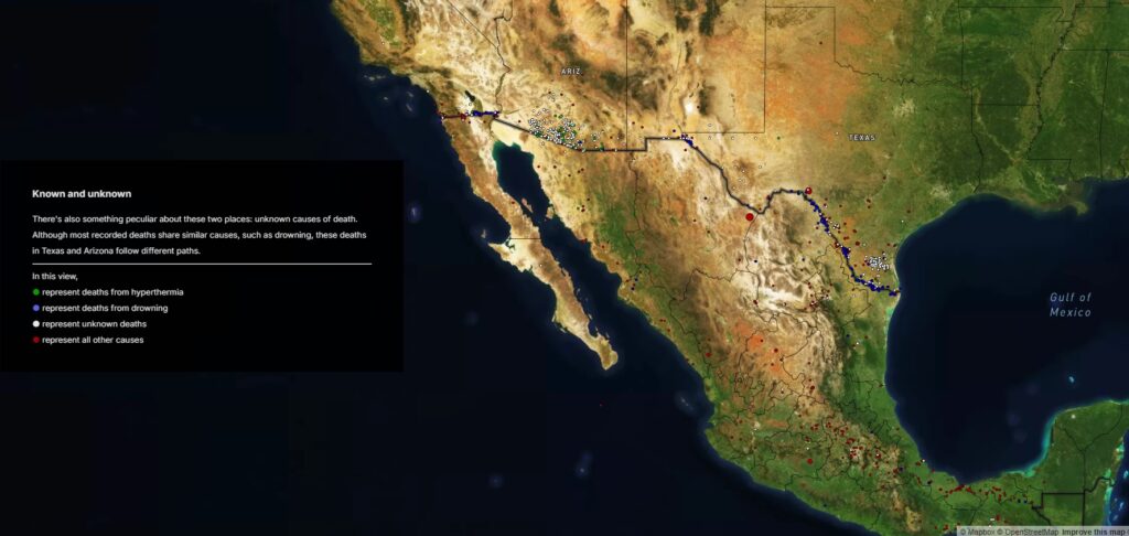
Image Source
Where the U.S. uses the dessert, Europe weaponizes the sea. European governments frame deaths in the Mediterranean as the tragic result of nature’s dangers. They label deaths, drownings, and responsibility shifts from the EU to mother nature. But these deaths are not natural. They result from the refusal to conduct search and rescue operations. A duty spelled out in international maritime law. This negligence has turned the Mediterranean into the deadliest migration route in the world. Deathmaps highlight the responsibility of governments for the deaths that they enable.
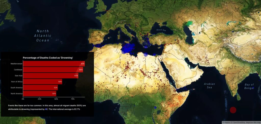
Image Source
Demanding Accountability
Death mapping doesn’t stop at exposure. It can be a tool for demanding justice.
Through death mapping, No More Deaths shows how Border Patrol undercounts migrant deaths. Especially those caused directly by border enforcement. Deaths from people falling from border walls or resulting from border patrol pursuits. Their data showed that in 2020 alone, actual deaths were as many as three or four times official figures.
No More Deaths used this information to put pressure on the government. They demanded that Border Patrol:
- End practices of foot and vehicle chases
- Allow outside oversight of their death reporting.
Similarly SOS MEDITERRANEE has used mapping to highlight the effectiveness of their search and rescue operations. They use this information to Pressuring the EU to:
- Set up systems for safe disembarkation of survivors
- Reinstate government led rescue operations
- Stop harassing and obstructing civilian vessels conducting search and rescue operations
Why use Death Mapping?
Death maps can be a powerful tool for human rights advocacy. Organizations are showing how they can highlight harmful policies and resist violence at borders. Death maps challenge us to see the human cost of intolerant policies. These maps don’t just reflect the world, they are tools that help us shape it.
Explore examples of counter cartography, see the Decolonial Atlas or the Counter Cartography Collective.